
Unboxing used to be a moment. Now it is a stage. A simple box can spark joy, trigger a share, even start a trend. You have seen it in unboxing videos that rack up views fast. Packaging surprises and delights, and that feeling sticks.
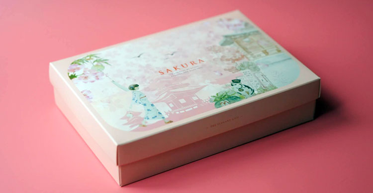
Brands have moved from plain brown boxes to story-filled custom mailer boxes that people want to keep. In 2025, this shift has a clear driver: buyers care about sustainability and authenticity. They want to know the why behind what they buy. Your box, label, and insert can deliver that why in seconds.
This guide shows why packaging works as a marketing tool, what trends matter now, real examples that sell, and quick steps to start today. You do not need a giant budget. You need a clear story and a smart box.
Why Packaging Can Tell Your Brand’s Story and Boost Sales
Great packaging does more than protect a product. It captures attention on a shelf or in a feed, then turns a simple purchase into a small event. People remember how you made them feel. That is the power of story.
In 2025, small brands use packaging to punch above their weight.
Connected packaging, like QR codes or AR, gives buyers a direct line to your world. Well-executed QR and connected packaging campaigns in FMCG often see scan-through rates in the range of 14–15, far higher than many ad click benchmarks. That is attention you can measure, not guess.
One dairy brand used interactive on-pack quizzes and a digital booklet about sustainability, and sales climbed 30% in 12 weeks. That is not hype, that is smart design plus a simple story.
Why does this work so well? Stories help our brains link facts to feelings. A box that shows your values, your sources, or your people creates a bond, especially when thoughtful packaging and fulfillment partners like Ship with Mina help bring that story to life. Color shapes mood. Type sets tone. Images make ideas concrete.
Building Emotional Connections Through Design Choices
Design choices speak before words do. Use them on purpose.
- Color with intent: Earthy tones, recycled paper, and matte finishes suggest eco-friendly values. Bright, high-contrast palettes shout fun and flavor. Pick a palette that matches your promise.
- Type as a voice: Rounded sans-serif fonts feel friendly. Sharp serifs feel classic. Keep two fonts max for clarity and pace your hierarchy. Your brand name, then key benefit, then the short story.
- Illustrations for warmth: In 2025, hand-drawn, playful elements keep things human. A small sketch of your farm dog, a map to the orchard, or doodles of ingredients adds charm without clutter.
Tip: Print a small batch, put it on a shelf, and squint from six feet away. What stands out? If it is not the key benefit and your brand name, rework it.
The Role of Sustainability in Your Packaging Narrative
Buyers, especially younger ones, look for proof of care. Eco-friendly materials and honest sourcing win trust. Skip vague claims. Show simple facts.
- Use recycled or compostable materials, then say exactly what they are.
- Add a short origin line, like “Box made with 70% post-consumer fiber, sourced in the Midwest.”
- Include a QR code with a 30-second clip that shows the supply chain, the people, and the impact.
This builds authenticity without greenwashing.
Top Trends in Storytelling Packaging for 2025
Interactive Packaging That Engages Customers Digitally
QR codes and AR add depth to the unboxing. They are simple to add and cost little.
Pros:
- Deeper engagement: Show how-to videos, founder notes, or behind-the-scenes clips.
- Trust: Link to authenticity checks, test results, or source maps.
- Offers: Share rewards, bundles, or refill reminders tied to the product.
Cons:
- Tech barriers: Some buyers will not scan. Keep the core story readable without a phone.
- Maintenance: Pages and videos must stay updated. Broken links hurt trust.
Quick steps:
- Create one mobile-friendly page with a short welcome video, a benefit recap, and a clear next step.
- Place a QR near a callout like “Scan for our 30-second story.”
- Track scans, watch dwell time, and adjust content monthly.
Fun and Authentic Designs That Stand Out
A playful look can still sell serious quality. The sweet spot is human and clear.
- Illustrations: Food, beverage, and cannabis brands use bold drawings, mascots, and pattern frames to add joy. It feels less corporate, more neighborly.
- Color blocks: Strong color panels make flavors and strains easy to spot. They photograph well for social media.
- Heritage cues: Short lines like “Family owned since 1986” or “Grown at 4,800 ft” add depth without long copy.
This style cuts through the polished look many big brands use. It says, “We are real people. This is our story.”