


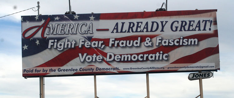
The 7-second rule in billboard advertising is the idea that a person should be able to understand your message in about seven seconds or less. In many cases, they may have even less time. Drivers are moving, watching traffic, checking mirrors, following signs, and making decisions, so your billboard has to communicate quickly.
This is one of the first principles a billboard advertising agency will apply when helping a brand plan a campaign, since creative that fails this test rarely performs well regardless of placement.
This rule is a practical guideline for creative, reminding advertisers that billboards are not brochures, landing pages, or social media captions. They are fast, visual messages that need to be read and remembered at a glance.
The Rule Starts With One Clear Message
The biggest mistake advertisers make is trying to say too much. They want the billboard to explain the company, list every service, include a phone number, promote an offer, show a product, mention a location, and add a clever headline.
That is too much work for a fast-moving audience. A stronger billboard usually focuses on one idea. It might introduce the brand, promote a limited-time offer, direct drivers to an exit, build awareness of a new product, or create a single emotional impression.

Copy Should Be Short Enough To Read Instantly
The 7-second rule is closely tied to word count. Many billboard creative guidelines recommend keeping copy to around seven words or fewer. This just means that every extra word should earn its place.
Short copy gives the audience less to process. It also lets the design use larger type, more breathing room, and a stronger visual hierarchy. A simple phrase can often do more than a full sentence.
For example, “Now Open” may work better than a long explanation of a new location. “Exit 12 for Dinner” may be more useful than a full restaurant description. “Feel Better Faster” may be easier to remember than a list of healthcare services.
Design Has To Work From a Distance
The 7-second rule also applies to design, as it plays a major role in how quickly people can understand a billboard. Large text, high contrast, bold imagery, and simple layouts help viewers process the message from a distance. Thin fonts, small logos, low-contrast colors, and busy backgrounds can make the ad harder to read, even if the message itself is strong.
A billboard design should be tested as it will actually be seen. Looking at a mockup on a laptop is not enough. The creative should still work when viewed small, from across the room, or at a distance. If the main idea disappears, the billboard needs to be simplified.

The Visual Should Support the Message
Images can help a billboard communicate faster, but only when they are easy to understand. A single strong visual is usually more effective than a collage, crowded product lineup, or complicated scene.
The image should reinforce the message instantly. A burger ad should make the food look appealing. A home services ad might show the problem the company solves. A travel ad might show the destination or the feeling the campaign aims to leave people with.

If viewers have to figure out what the image means, it may slow down the billboard. Under the 7-second rule, the visual should reduce friction, not create more.
Calls to Action Should Be Simple
A billboard call to action should align with how people see the ad. Drivers may not be able to scan a QR code safely or remember a long URL. Pedestrians and transit riders may have more time, but the action still needs to be easy.
Simple calls to action often work best. A short website, a memorable brand name, a nearby exit, a location cue, or a direct phrase like “Visit Today” can be enough. The right choice depends on the placement and campaign goal.
Media Planning Affects the 7-Second Rule
Creative is only one part of the equation. Placement also affects how quickly a billboard can be understood. A board on a fast highway needs even simpler copy than a board near a pedestrian plaza. A digital screen in a busy city may need stronger contrast than a static board on an open road.
A strong media plan considers speed, sightlines, traffic patterns, dwell time, and the audience’s likely mindset. The same creative may not work equally well in every location.
The Best Billboards Respect the Viewer’s Time
The 7-second rule works because it keeps advertisers honest. It forces brands to ask whether the message is truly clear, readable, and memorable in the real world.
Rather than trying to say everything at once, a successful billboard says the right thing quickly. It uses short copy, bold design, one strong visual, and a placement that gives the message a fair chance to land.
When brands respect the limits of attention, billboard advertising becomes more effective. A viewer may only glance at the ad for a moment, but if the message is simple enough, that moment can still be enough to remember the brand.